
When an Internet disruption occurs, it is presumably obvious to the impacted parties as their favorite Web sites and applications immediately become unreachable, video/voice/text messaging apps fail to connect, and popular streaming media sites become unavailable. However, how can we as external observers know that this disruption has taken place, and how can we determine its scope?
Fortunately, there are several organizations that monitor and measure the Internet and can use the resulting data to detect when disruptions occur; some of these organizations can also use ‘data exhaust’ from their service delivery platforms to provide another perspective, or to corroborate observations from their monitoring/measurement data.
Changes occurring in several different metrics can be used to identify an Internet disruption and determine its scope. These metrics include, but are not limited to:
- BGP: The number of routed BGP prefixes geolocated to a given country present in the global routing table
- Traceroute completions: The number of completed traceroutes to target endpoints in a given country
- Active probing: The number of successful pings to target endpoints in a given country
- Traffic: Requests made to active DNS or Web servers, or connection attempts made to darknet infrastructure
- Local measurements: Performance and availability tests (often of popular social, messaging, and streaming media sites) run from last-mile hardware devices or from applications installed on an end user’s mobile device
Accurate IP geolocation information plays a critical role here too, because it is important to be able to attribute the traffic to the appropriate originating geography, and to associate target and intermediary IP addresses and ASNs with the right geography as well.
Identifying
As mentioned previously, there are a number of organizations that monitor and measure the Internet, analyze the collected data, and make the results of this analysis publicly available. Most often, these organizations leverage Twitter to post about Internet disruptions that they have identified through analysis of their data.
Oracle’s Internet Intelligence team has been measuring the Internet for over a decade, going back to its days as an independent company known as Renesys. Tweeting at @InternetIntel, the team highlights Internet disruptions and outages seen through its Internet Intelligence Map. (Full disclosure: I was a member of this team from July 2017 to March 2019.)
https://twitter.com/jetpack/status/1122886803202113536The Center for Applied Internet Data Analysis (CAIDA) conducts network research and builds research infrastructure to support large-scale data collection, curation, and data distribution to the scientific research community. Their Internet Outage Detection and Analysis (IODA) project is developing an operational prototype system that monitors the Internet, in near-realtime, to identify macroscopic Internet outages affecting the edge of the network. Tweeting at @caida_ioda, project members highlight Internet disruptions and outages seen in its overview dashboard.
The @BGPStream Twitter feed is a service of BGPmon.net, founded by Dutch Internet engineer Andre Toonk. BGPmon itself was acquired by OpenDNS in March 2015, and OpenDNS was subsequently acquired by Cisco in June 2015. The BGPmon platform monitors changes to the global routing table, and positioned the BGPStream feed as “a free resource for receiving alerts about BGP hijacks and large scale outages.” (However, Cisco has announced EOS/EOL for BGPmon, so the future of @BGPStream is unclear.)
The NetBlocks Group describes itself as “a civil society group working at the intersection of digital rights, cyber-security and internet governance.” Through what it claims are novel measurement, classification and attribution techniques, it detects Internet disruptions, censorship, and cyber attacks on critical infrastructure and applications, and Tweets its observations and findings at @netblocks. While many of the posted observations are about censorship or blocking of social media and messaging tools, the account also covers country-wide Internet disruptions.
The Internet Health Report was a program out of the Internet Initiative Japan (IIJ) Innovation Institute that used network performance data from RIPE Atlas and CAIDA’s BGPStream (not the same one as referenced above) to monitor for delays and disconnections across the Internet. Tweeting at @ihr_alerts, it highlighted disconnections at both a country and network level. Although the project’s Web site shows current data, it’s last Tweet was posted in April 2018, so the general status of the project is unclear.
Team members at cloud network platform Cloudflare also publish Tweets and blog posts highlighting shifts in platform traffic due to Internet disruptions. However, these posts appear to be done more opportunistically or in response to an inquiry – they aren’t alerting on every significant drop in traffic from a given country.
Of course, setting up Google Alerts and Twitter searches for “Internet outage” (or similar terms) will also surface issues, but the actionable signal-to-noise ratio here is fairly low, and is often extremely localized. Monitoring the social media feeds of local telecom providers is another source of information, but my experience has been that very few of them proactively post outage reports and status updates — kudos to those that do. (Canada’s Shaw Communications is an example of the latter, posting service outage and update information in their Support Community.)
Visualizing
The publicly available visualizations of Internet disruption activity tend to make use of line/area graphs, illustrating variations over time in the monitored/measured metrics, with significant often highlighted. While this would seem to be the most straightforward way to look at the data across a given time period, it would be interesting to explore the use of alternative visualization types that could help make occurrence or severity patterns more obvious, for example.
The Oracle Internet Intelligence Map is a key source of insights about Internet disruptions, with issues plotted on a map of the world, color coded by severity. Traceroute completion rates, BGP route changes, and DNS query traffic are analyzed to identify and highlight Internet disruptions at a country level, as shown in the figure below. The country-level graphs are plotted at a 15 miunte granularity, and run about three hours behind real time.
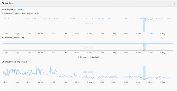
A country-level graph from Oracle’s Internet Intelligence Map
Oracle’s tool also enables users to drill down into disruptions at a network (autonomous system) level through graphs that illustrate the networks immediately upstream of the network of interest – that is, what networks did traceroutes last past through before entering the target network. Observed changes in latency or completed traceroute volume, as shown in the figure below, can often provide clues about the likely root cause, or where to begin looking to try to determine a cause. These network-level graphs are plotted at an hourly granularity and also run about three hours behind real time.
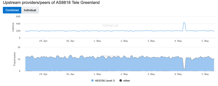
A network-level graph from Oracle’s Internet Intelligence Map
The CAIDA IODA tool also provides visibility into observed at both country and network (ASN) levels. The country-level graph, shown in the figure below plots measured changes to darknet traffic coming from IP addresses geolocated to the country of interest, active ICMP-based probing of routable IP address space in the country, and BGP route changes for prefixes geolocated to the country. The country-level view is approximately 30 minutes behind real time, and the metrics are plotted at one minute (darknet), five minute (BGP), and ten minute (active probing) granularity.
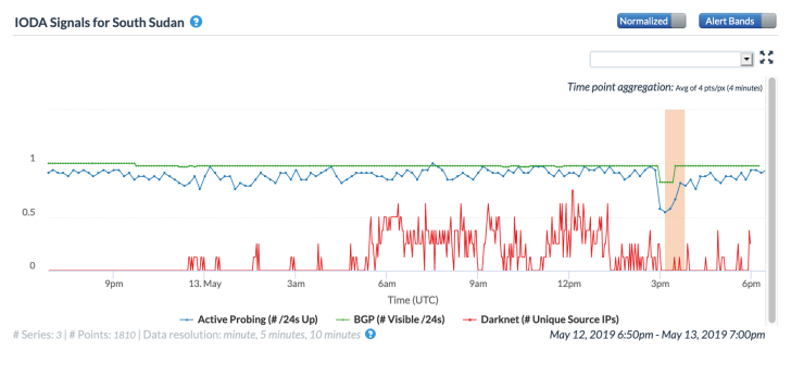
A country-level graph from CAIDA’s IODA tool
Simlar to Oracle, the IODA tool also visualizes Internet disruptions at a network level. As shown in the figure below, network-level graphs show changes measured in active probing and BGP routes, with the delay and granularity the same as seen at the country level.
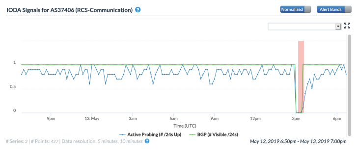
A network-level graph from CAIDA’s IODA tool
Given the volume and distribution of traffic that Google sees to its platform, it is no surprise that Internet disruptions would be evident in country-level visualizations of that traffic. The Google Transparency Report site states that it is “Sharing data that sheds light on how the policies and actions of governments and corporations affect privacy, security, and access to information.” Within that site, there is a “traffic and disruptions” section that effectively graphs a country’s traffic to the selected Google product over the selected time period, and disruptions to a country’s Internet connectivity are evident as sharp, and potentially extended, drops in the graph. Data is graphed at a 30 minute granularity, and runs through the previous calendar day.
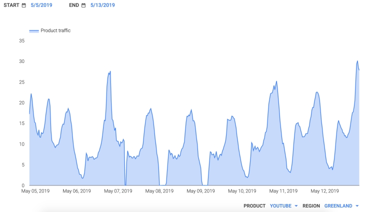
A country-level traffic graph from the Google Transparency Report
Similar to Google, Akamai’s Edge Platform also delivers massive amounts of traffic to users all across the globe. As such, graphs of its traffic at a country level will also show evidence of Internet disruptions that take place around the globe, such as those seen in the figure below, taken from an issue of the State of the Internet/Connectivity Report. Unfortunately, these graphs are no longer available, as the last issue of the report was published in the first quarter of 2017. (Full disclosure: I was the founding and primary editor of Akamai’s State of the Internet/Connectivity report series.)
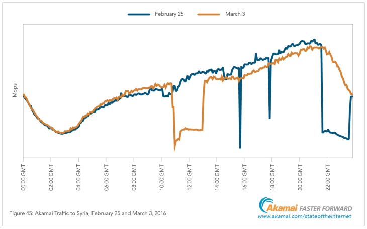
A traffic graph from Akamai’s State of the Internet/Connectivity Report
Conclusion
Disruptions to Internet connectivity can be caused by damage to submarine cables or terrestrial fiber, problems with satellite/microwave links, power outages, and severe weather events. These types of disruptions are often unexpected (physical damage) or unavoidable (severe weather). However, the impact of these types of disruptions can often, though not always, be mitigated through disaster recovery planning that includes backup connectivity via alternate providers and types of connections (where available).
Unfortunately, government-directed Internet disruptions are becoming more common, where local providers are ordered to limit or block access to selected applications, or shut down subscriber access altogether. Providers generally have minimal recourse when such disruptions are ordered, and disaster recovery planning offers little benefit.
Regardless of an Internet disruption’s ultimate cause, the fact that there are organizations monitoring and measuring the Internet and making their insights publicly available is a good thing, because it provides visibility into how frequently such issues occur, as well as the breadth of their impact. Looking at different metrics across the various tools also allows us to corrobrate our observations, confirming that a suspected disruption did, in fact, occur.
